In my two-year tenure as a UX/UI Designer at Lantum, I played a pivotal role in a team that championed innovation and user-centric design. Our collective journey, steered by Melissa Morris (CEO), and shaped by the strategic insights of Anna Kuriakose (CPO), along with the technical leadership of Michael Skelly (CTO), was dedicated to refining our platform across mobile and web applications. Joe Bradley, as our meticulous user researcher, provided essential insights that informed every design decision, ensuring they were impactful and tailored to our users’ needs. Complementing our team’s expertise, Gideon Bullock, our director of product design, was instrumental in establishing a cohesive and resonant visual language that further enhanced the intuitive experience of our applications. Meg Porter, as a key product designer, also made significant contributions, helping to shape the innovative solutions that empowered locum doctors and streamlined healthcare management practices.
Context and Challenges
Shaping the Future of Healthcare Staffing
At the heart of Lantum’s vision to transform healthcare staffing was the empowerment of locum doctors—a mission that demanded a design approach as innovative as it was functional. We were poised to not only empower these doctors but also to pioneer a shift in the healthcare staffing paradigm. The agility inherent in our environment, characterized by two-week sprints, was our catalyst for continuous evolution, driving us to refine our features in sync with the dynamic demands of the healthcare sector.
Lantum’s bold vision was to empower locum doctors through a design-centric approach that was as functional as it was revolutionary. In an agile environment marked by rapid sprints, our team’s adaptability allowed us to meet the ever-evolving demands of the healthcare landscape, setting a new precedent for the staffing paradigm.
Our challenges were as diverse as they were complex:
- Brand Cohesion: We embarked on a quest to create a unified visual identity that would resonate across all platforms—mobile, web, and beyond. Our goal was to weave a consistent visual narrative that would become synonymous with the Lantum brand, ensuring a seamless experience for every user, regardless of their point of interaction.
- Feature Innovation: The pulse of our design ethos was innovation. We were committed to not just incrementally improving but revolutionizing the feature set available to locum doctors. This commitment meant delving deep into prototyping and exploring the frontier of new features that would enhance the daily professional life of a locum doctor.
- Marketing Redesign: Our design transformation extended to marketing materials as well. We aimed to align every piece of content with our core design principles, thereby amplifying Lantum’s brand impact and ensuring that our message was clear, cohesive, and compelling.
Embracing these challenges, we were not just designing; we were setting the stage for a new era in healthcare staffing—one marked by intuitive design and groundbreaking functionality.
Design Process
A Symbiosis of Strategy and Creativity
In-Depth Strategic Research and Collaborative Insight
Our design journey at Lantum began with an immersive dive into the ecosystem of healthcare staffing, with the goal to not just understand but to fundamentally enrich the experience of locum doctors. This phase was characterized by exhaustive strategic research, where we meticulously gathered data, dissected market trends, and empathized deeply with the pain points and aspirations of our users. Joe Bradley’s prowess in user research was indispensable, providing a rich tapestry of insights that informed every aspect of our design hypothesis. Together, we ventured beyond the surface, predicting future needs and crafting features that would not only meet but anticipate the challenges and desires of our users. This collaborative synergy was the crucible from which our most transformative ideas emerged, setting the stage for a design approach that was as visionary as it was user-centric.
Our design process was rooted in a deep understanding of our users, derived from comprehensive research. With Joe Bradley spearheading this initiative, we gained invaluable insights that guided our feature development. This collaboration was pivotal in our mission to anticipate user needs and deliver beyond expectations.
Agile Prototyping and Iterative Excellence
At the forefront of our design process was a thorough and strategic research phase, which served as the bedrock of our innovative endeavors. Partnering closely with Joe Bradley, our user research lead, we delved into an in-depth analysis of market trends, locum doctors’ pain points, and the anticipatory forecasting of their future needs. This collaborative effort was more than just research; it was an excavation of insights that would inform and inspire our feature set, setting a new benchmark for exceeding user expectations.
We championed an iterative approach to design, incorporating user feedback into rapid prototyping cycles. This allowed us to evolve our features swiftly and efficiently, always aligning with our users’ needs and the latest market trends.
Agile Prototyping and Iterative Excellence
We championed an iterative approach to design, incorporating user feedback into rapid prototyping cycles. This allowed us to evolve our features swiftly and efficiently, always aligning with our users’ needs and the latest market trends.
Visual Identity and Artistic Expression
Our prototyping was not a linear path but a dynamic dance of agility and precision. Embracing an iterative process, we refined and honed our features with a relentless commitment to improvement. The sprints were a catalyst for creativity, a period where we, as a team, rallied to distill user feedback and analytics into actionable design enhancements. The versioning strategy we adopted was not merely a methodology but a philosophy of continuous evolution, enabling us to fluidly adapt and iterate on our designs. Each sprint brought us closer to our goal, as we saw concepts mature from initial sketches to fully-fledged features. This rapid, agile approach minimized the latency from concept to deployment, ensuring that our solutions were not just timely but also technologically and contextually relevant.
Under Gideon Bullock’s direction, we developed a visual identity that was not only aesthetically pleasing but also deeply resonant with our users. Our bespoke artwork and icons became the visual hallmark of Lantum’s ethos, enhancing the intuitive nature of our user interface.
Visual Identity and Artistic Expression
Guided by Gideon Bullock’s seasoned direction in product design, we embarked on a mission to craft a visual language that would resonate profoundly with our users and become synonymous with Lantum’s core values. Every icon and artwork was a brushstroke in a larger picture, a meticulous effort to create an intuitive interface that users could navigate not just with their fingers but with their instincts. This was a design odyssey that combined the elegance of art with the clarity of purpose, ensuring that every visual element was not just seen but felt, enhancing the user experience in a way that was both subtle and profound. Our artistic endeavors were intentional strokes aimed at painting a user interface that was as inviting as it was efficient.
Under Gideon Bullock’s direction, we developed a visual identity that was not only aesthetically pleasing but also deeply resonant with our users. Our bespoke artwork and icons became the visual hallmark of Lantum’s ethos, enhancing the intuitive nature of our user interface.
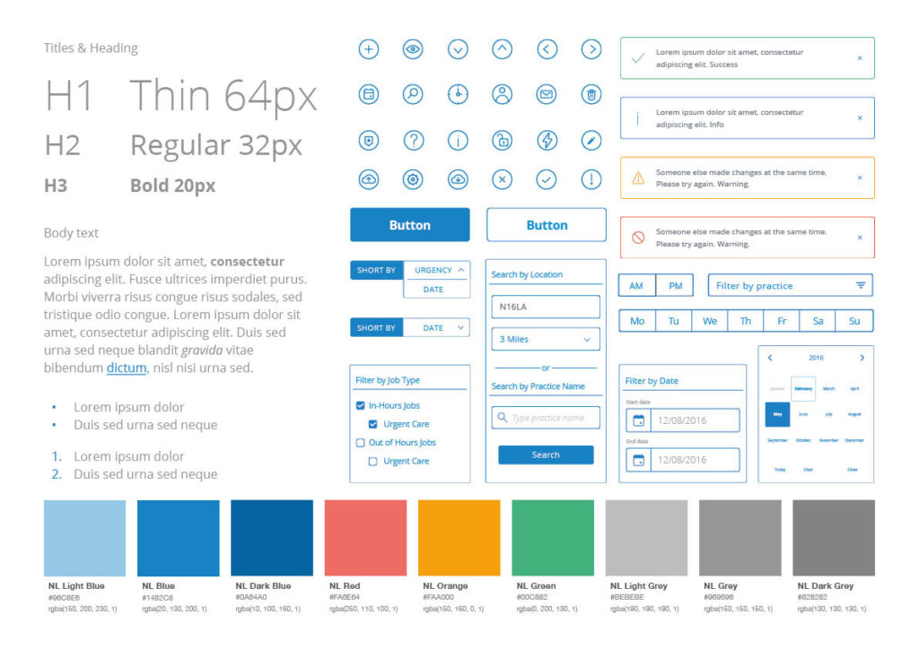
Architecting a Comprehensive Design System
The architecture of our comprehensive design system was a testament to our dedication to consistency and efficiency in design. It was an intricate framework that comprised a detailed and expansive component library, which became the cornerstone of our design language. This library was more than a collection of assets; it was the DNA of our application, ensuring consistency across every user interaction and touchpoint. By establishing this system, we reduced design and development time, enabling a seamless and symbiotic workflow between design and engineering teams. It facilitated a shared understanding and a unified approach to building our product, ensuring that each feature released was a building block towards a cohesive and user-focused digital ecosystem.
The design system was not just a tool but a living entity, evolving with each project and sprint. It was a repository for our collective knowledge, a space where we documented our design rationale, guidelines, and patterns. This living document allowed for new designers to onboard swiftly, aligning quickly with our methodologies and contributing to the design narrative that we were collectively authoring. It was an embodiment of our design ethos, a commitment to a scalable and sustainable approach to design that would stand the test of time and technological advancements.
In conclusion, our design process at Lantum was a multifaceted journey that intertwined strategy, agility, artistry, and engineering. It was a journey characterized by a relentless pursuit of excellence, a dedication to empathetic design, and a commitment to creating solutions that resonate on a human level. Through this journey, we have not only transformed the digital landscape of healthcare staffing but have also set new benchmarks for what is possible when innovative design meets user-centric focus.
We built a robust design system, including a detailed component library that became the backbone of our design consistency and efficiency. This system streamlined our design and development process, fostering a cohesive and dynamic workflow between teams.
Solution
Our solutions, from the onboarding experience to the “My Profile” and “Post a Job” features, were designed to empower locum doctors and practice managers alike. These features have profoundly transformed Lantum’s app into a comprehensive tool for healthcare staffing management, marked by seamless, intuitive user experiences.
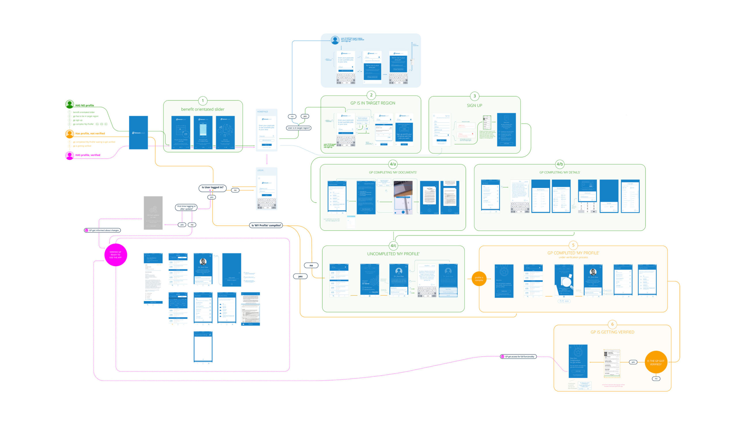
Onboarding Experience
The iOS app onboarding was meticulously crafted to orient users with Lantum’s offerings immediately upon sign-up. By incorporating a benefit-oriented approach and a sign-up process that differentiates users by location, we ensured a tailored experience that promotes a balanced supply-demand dynamic. I am particularly proud of the onboarding experience we designed for the iOS app, which was meticulously crafted to orient users with Lantum’s offerings from the moment they signed up. We ensured a tailored experience that promotes a balanced supply-demand dynamic.
Synchronized Mobile and Web Experience
My efforts to ensure coherence between the iOS app and the web application resulted in a unified user experience. This initiative was not just about aesthetics but also about incorporating features that addressed the unique needs of locum doctors, assisting them in daily professional and financial management. Our efforts, supported by Anna’s product vision, resulted in a seamless synchronization between the iOS app and the web application. This coherence was crucial in assisting locum doctors in their daily professional and financial management.
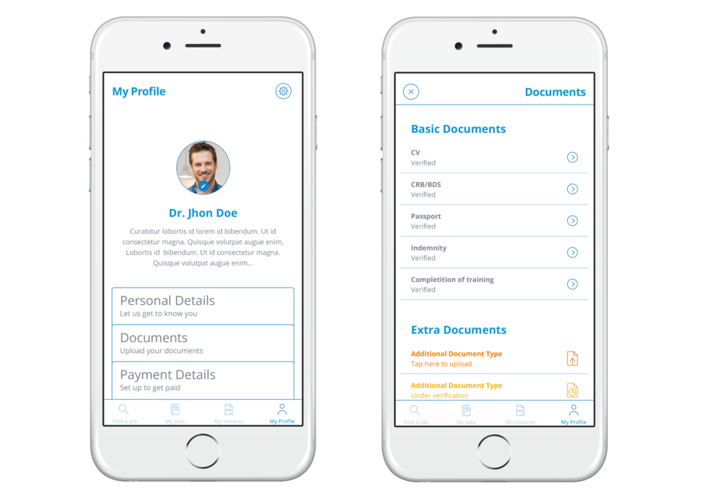
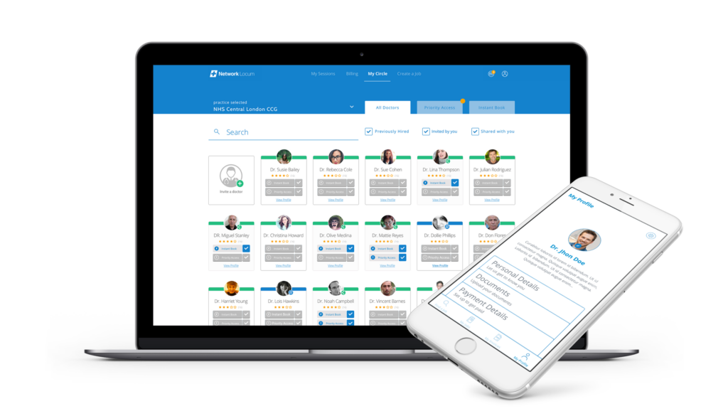
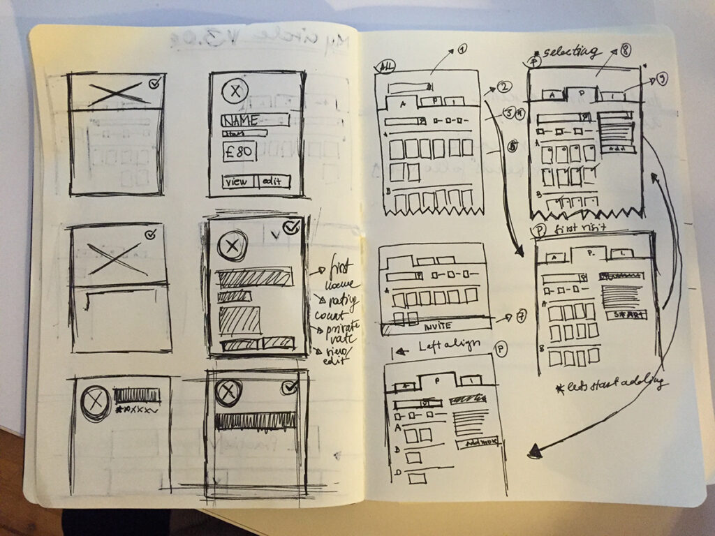
Profile and Document Management
The “My Profile” feature was a central hub for locum doctors, and Joe’s research was instrumental in shaping this feature to ensure it met their needs perfectly, allowing for seamless management of professional details. The “My Profile” feature was a central hub for locum doctors, and Joe’s research was instrumental in shaping this feature to ensure it met their needs perfectly, allowing for seamless management of professional details.
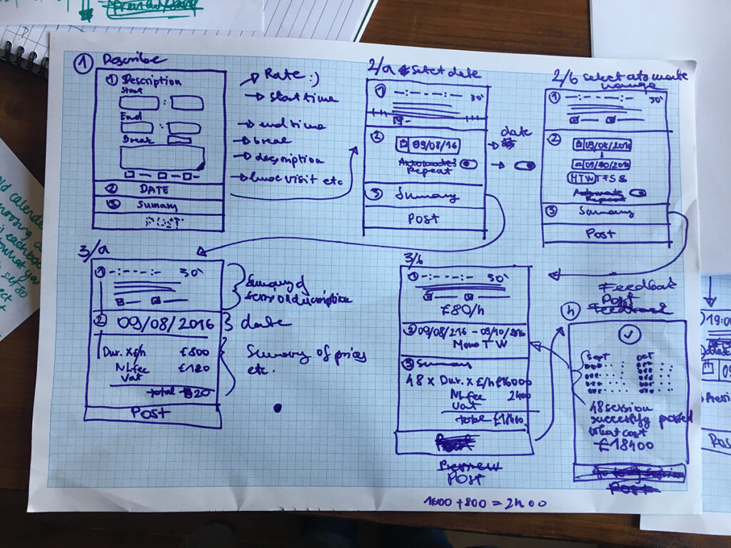
Billing System Redesign
I reimagined the billing experience to optimize the invoicing process. This feature allowed for pre-invoice timesheet updates, thus streamlining payments and mitigating disputes. The result was a more efficient financial interaction between locum doctors and healthcare facilities. Together, we reimagined the billing experience, optimizing the invoicing process and streamlining payments — a move that has significantly reduced disputes and improved the financial workflow for locum doctors.
Job Creation and Management
The “Post a Job” feature was a critical addition, empowering practice managers to create session items via the web app. This feature facilitated a more efficient way to manage and fill staffing needs, directly impacting the operational efficiency of healthcare practices. With the “Post a Job” feature, we empowered practice managers to efficiently create and fill staffing needs, directly impacting the operational efficiency of healthcare practices.
Comprehensive Job and Session Management
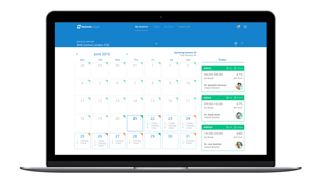
With the “My Sessions” feature, I introduced a calendar view that allows practice managers to oversee their staffing rota with ease. The design’s clarity, combined with an intuitive UI and streamlined UX, has made this feature one of the most frequented within the app.
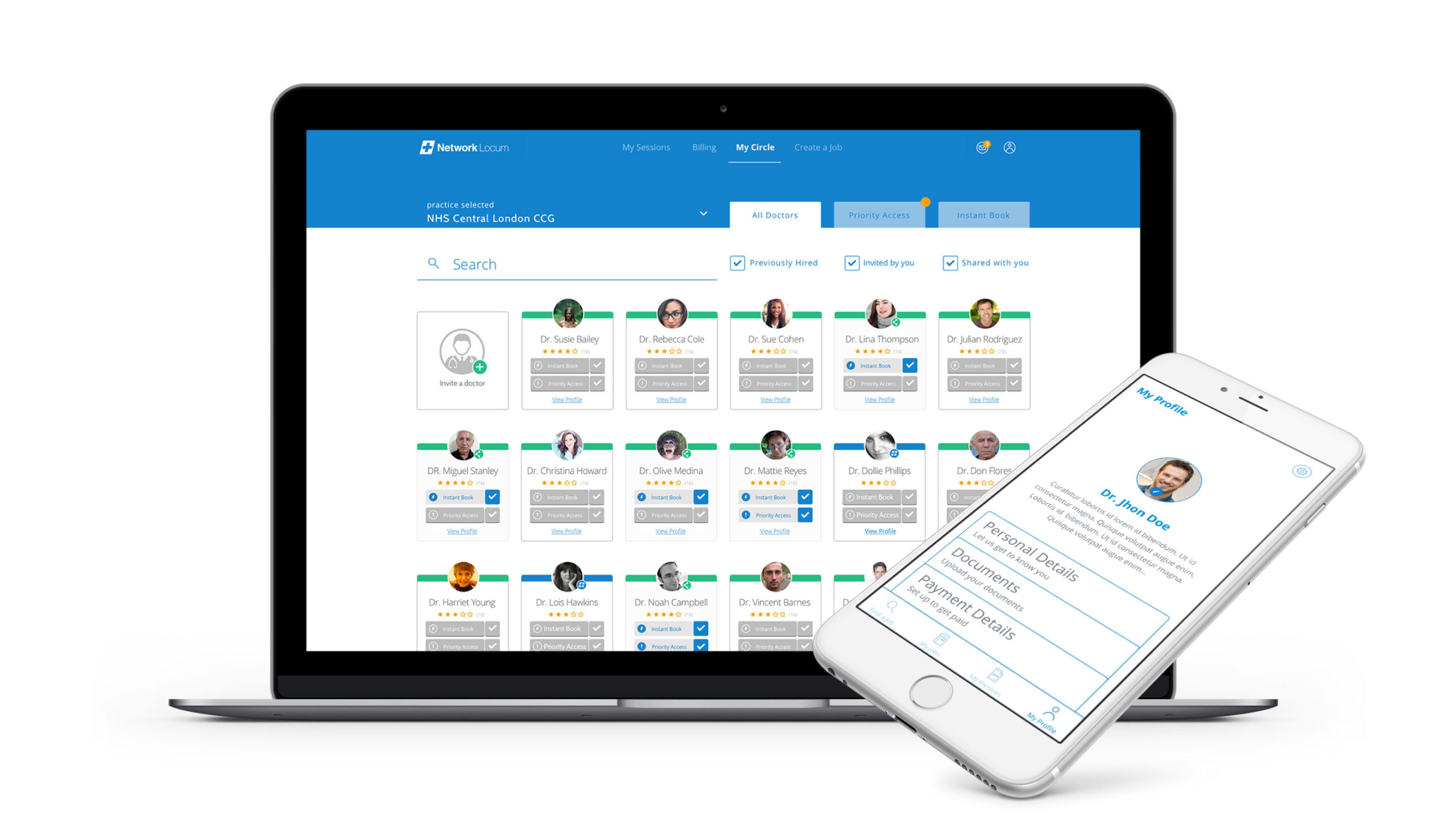
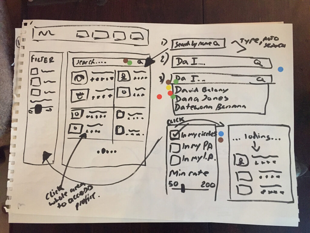
Empowering Practices with ‘My Circles’
I designed the “My Circles” feature to function like an address book for practice managers, streamlining the process of searching for and managing contacts. This feature not only enhanced connectivity within the healthcare community but also solidified the app as an indispensable tool for healthcare practice management.
Outcome and Impact
Redefining Healthcare Staffing Through Design
The comprehensive suite of features I had the privilege of developing at Lantum has revolutionized the app into an all-encompassing tool for healthcare staffing management. The impact of these features is profound—from empowering locum doctors with the autonomy to manage their professional profiles and financial transactions to equipping practice managers with robust functionalities for job postings and session management. Each design iteration was meticulously calibrated to enhance usability, ensuring that every interaction with the app was as seamless and intuitive as possible.
The efficacy of our design initiatives is reflected in tangible metrics that signify a leap in user engagement and a boost in operational efficiency. For instance, the redesigned onboarding process not only resonated with users but also played a crucial role in improving user retention rates, a testament to its streamlined clarity and user-centric approach.
A pivotal component of our success was the implementation of a unified design system and a comprehensive component library. This strategic move significantly reduced production timelines, thus fostering an environment where agility in responding to user needs and market changes became our standard operating procedure.
Moreover, the feedback we’ve received from users post-redesign has been overwhelmingly positive, underscoring a marked increase in satisfaction with the app’s functionality. This is particularly notable in the realms of billing and job management—areas that are critical to the daily operations of our users.
As we look at the broader implications of our work, it is clear that the design strategies we employed have not only met but have also propelled us towards achieving Lantum’s ambitious goal of contributing to the NHS’s cost savings. By placing a high value on user experience and operational efficiency, we’ve played a part in a larger narrative of cost reduction and enhanced healthcare services, setting a precedent for how thoughtful design can yield significant benefits in the healthcare industry.
Visual and Aesthetic Direction
In crafting the visual and aesthetic direction for Lantum’s app, our meticulous selection of a color palette was more than a mere design choice—it was a strategic decision aimed at enhancing user experience through simplicity and efficiency. We delved into the psychology of color, opting for shades of blue, white, and grey not only for their professional and clean appearance but also for their ability to instill a sense of trust and reliability, qualities essential in the healthcare profession.
This deliberate curation of colors and visuals, showcased in the app and highlighted through the accompanying videos and images in this post, was integral to our design philosophy. The chosen palette not only supported a visually pleasing interface but also functioned to minimize distractions, ensuring that the app’s features remained the focal point. This approach to design placed user needs and app functionality at the forefront, fostering an intuitive experience for healthcare professionals who require precision and clarity in their daily operations.
By maintaining the design’s simplicity, we allowed the true essence of the features to shine through, enabling users to navigate the app with ease and confidence. The interface, with its clean lines and uncluttered layout, complements the complex nature of healthcare management, making it accessible and straightforward for all users. This harmonious balance between aesthetic appeal and functional design underscores our commitment to delivering an experience that is not just visually engaging but also profoundly user-friendly, setting a new standard for software in the healthcare industry.
Conclusion
This case study embodies the synergy of collaborative design, agile methodologies, and a steadfast commitment to functionality and user-centric solutions. Under the combined influence of Joe Bradley’s insightful research, Michael Skelly’s technical acumen, Gideon Bullock’s design expertise, along with the strategic guidance of Anna Kuriakose and Melissa Morris’s visionary leadership, we have not only elevated Lantum’s aesthetic appeal but also cemented its functionality to meet and exceed user needs. The collective efforts of our team have been pivotal in redefining healthcare staffing solutions, significantly contributing to Lantum’s mission of saving the NHS £1bn in staffing costs and underscoring the profound impact that thoughtful and collaborative design can have within the healthcare industry.
Future Directions
The journey at Lantum is ongoing, the design team’s dedication to continual refinement and expansion of solutions. Embracing a cycle of perpetual feedback and relentless innovation, they are unwavering in our commitment to adapt and evolve our offerings. This ensures that their products not only meet but also anticipate the changing needs of healthcare professionals, maintaining our position at the forefront of healthcare staffing solutions.


Feladatok
- UX tervezés
- UI tervezés
- Prototípus készítés
- Arculat tervezés
- Marketing anyagok tervezése
Eszközök
- Sketch Mac
- Adobe Illustrator
- Adobe Photoshop
- Adobe Indesign
